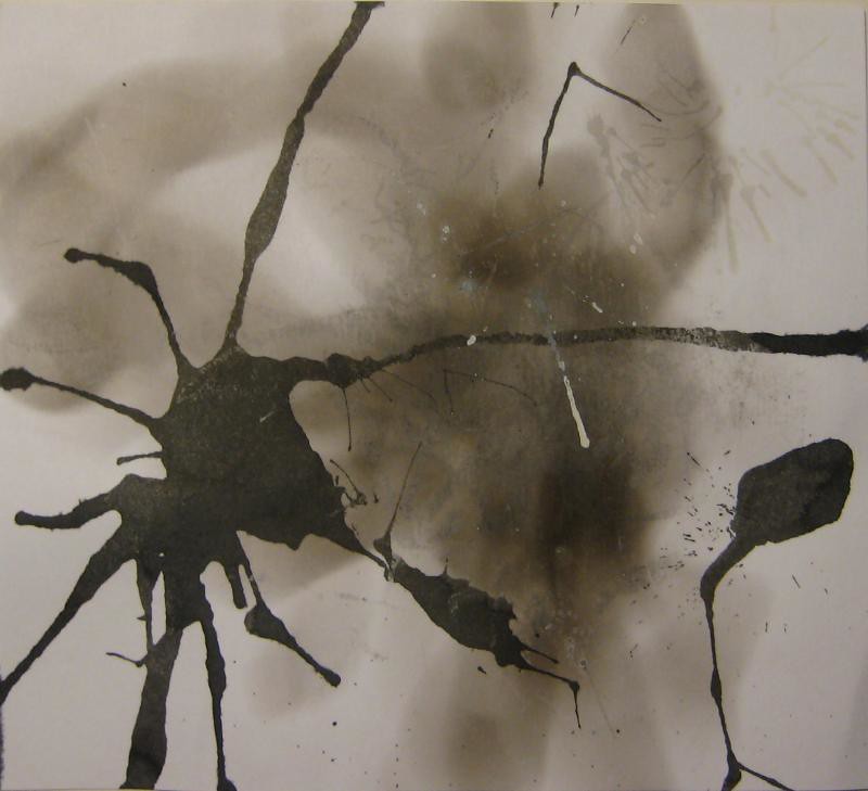
I like all of these for basically the same reasons. The color, line, texture, composition, and content are all working together to make images that have mystery, charm, and make me want to keep looking at them.
add solid and deal with the fall out?
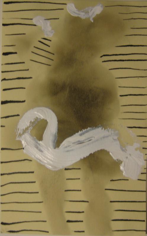
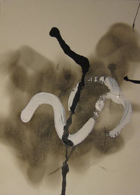
These are in limbo, no love from me but no hate...
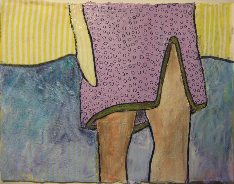
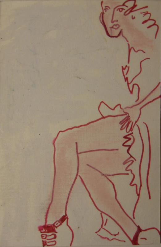
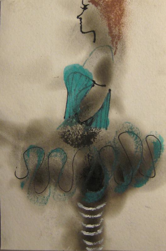
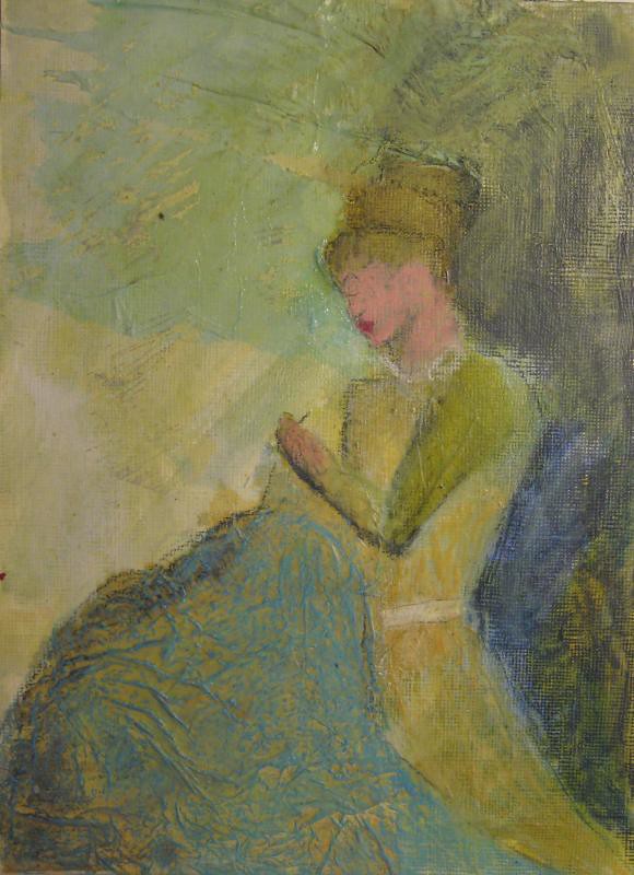
I like the yellow stripey section and the skirt texture. I don't like the composition in general. i hate the texture of the blue.
more of what that hands doing?
This was a first layer, I actually really like it but it doesn't seem done. I haven't figured out what to do but I keep looking at it and not doing anything...
very careful and painstakingly add in some tons, fine pens
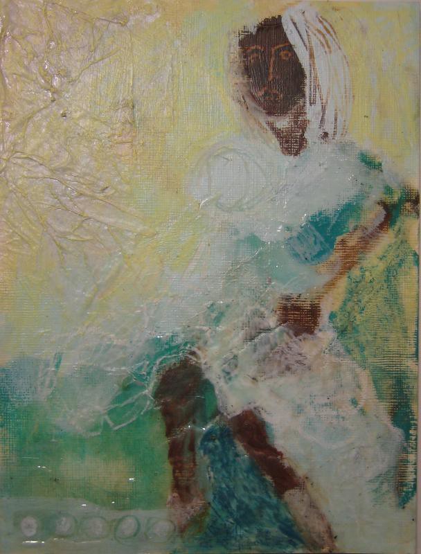
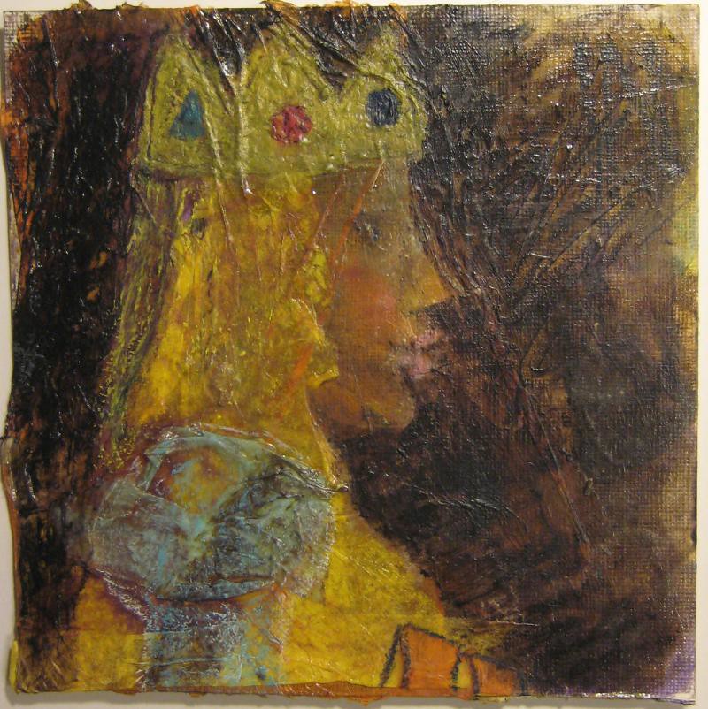
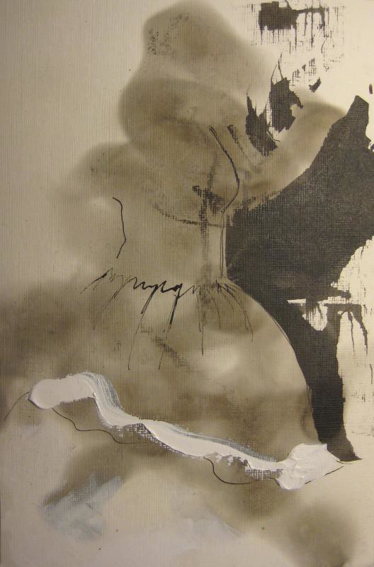
I've worked on this a bunch of times. I like the way the white is layered with the clear but I don't like the hear/face/hair area. I like the colors.
omit figure!
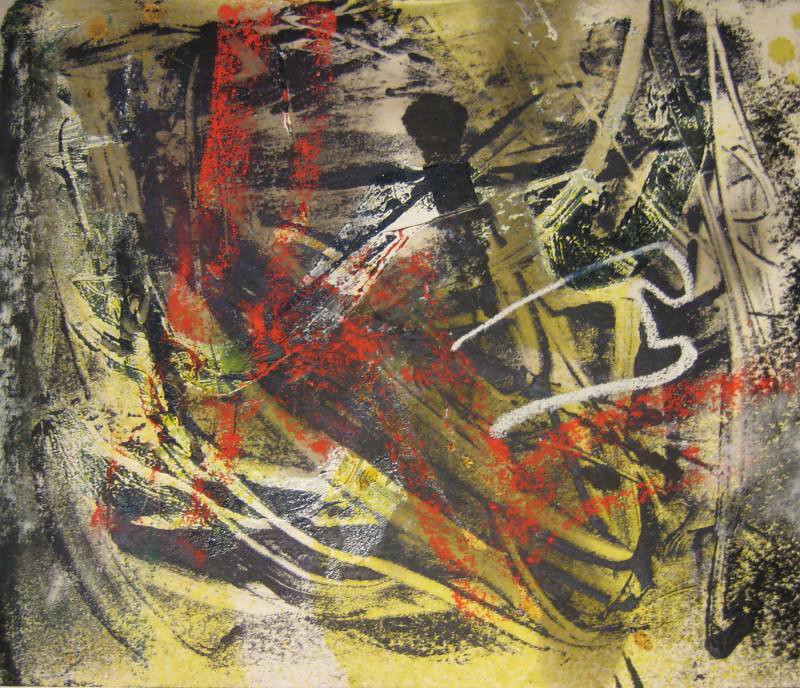
I think this is about done. I need to look at it more. The red and the white line are saving the day.
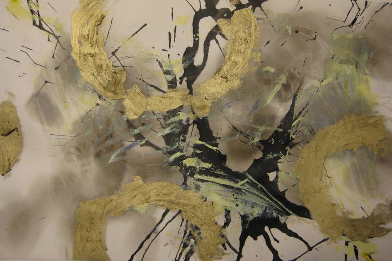
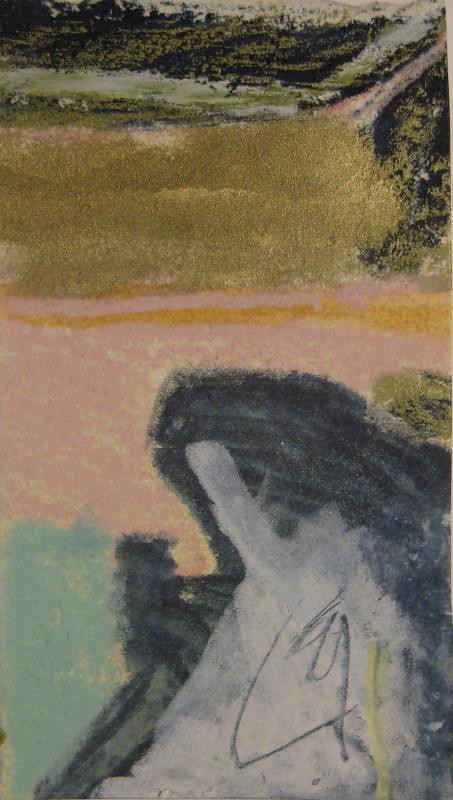
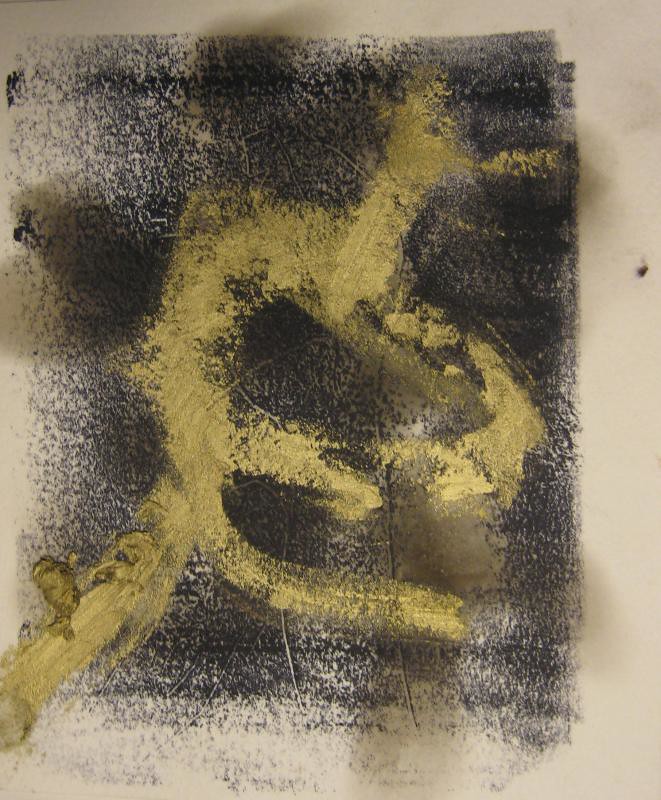
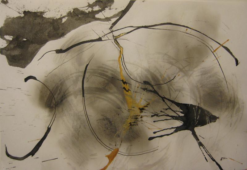
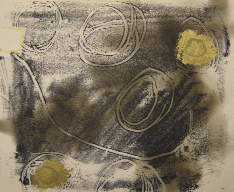
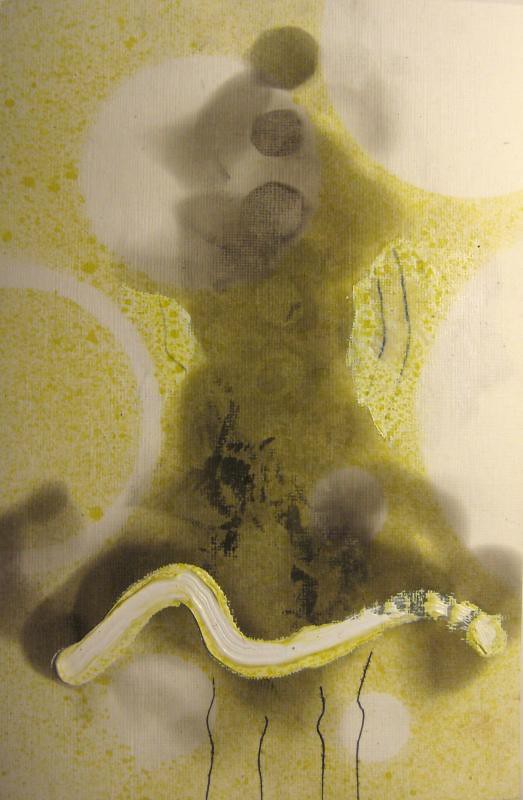
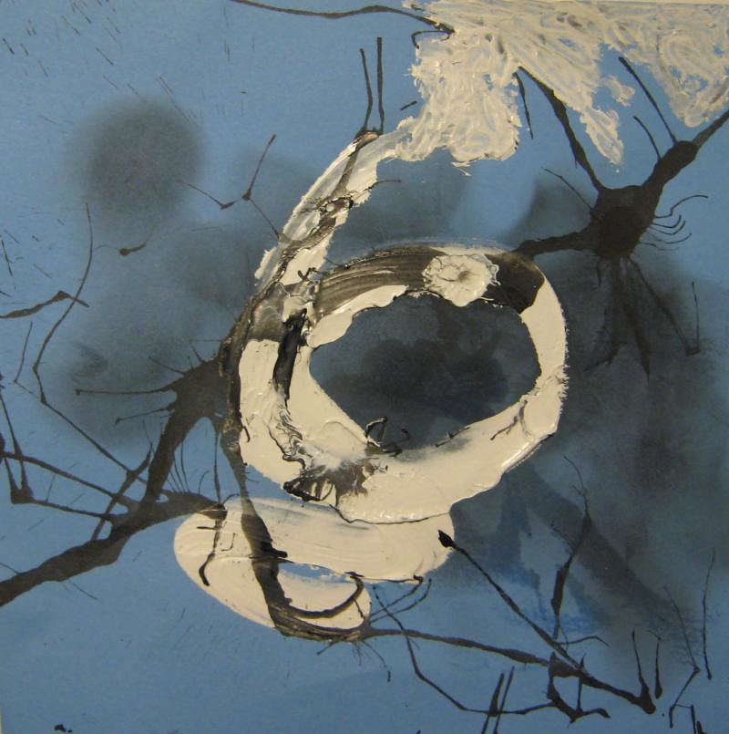
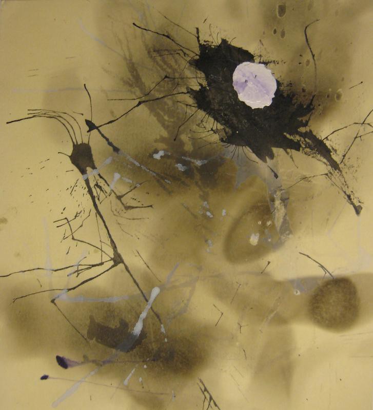
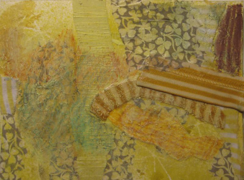
I think this needs something to strap down the gold circles. I like the relationship of the shape and line. I like the depth.
print circles inside circles? white?
I have no feelings about this whatsoever.
or this... it's just kinda pointless.. it's not bad, it's just not good.
I like the quality of the line and the depth but it's just leaves me wanting more.
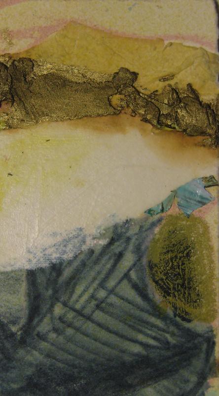
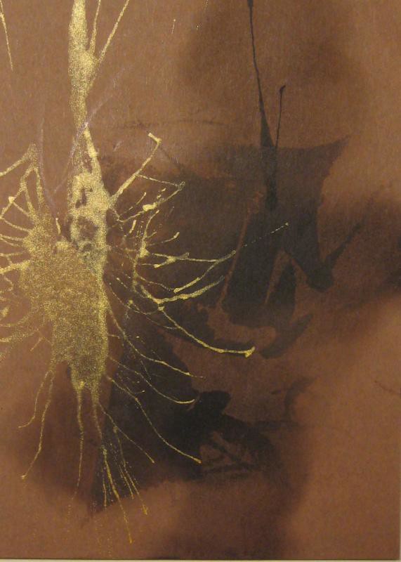
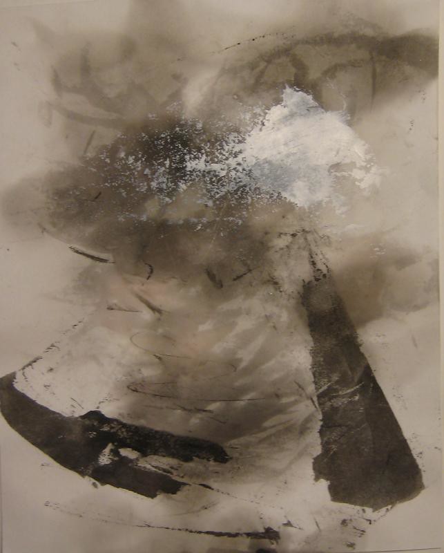
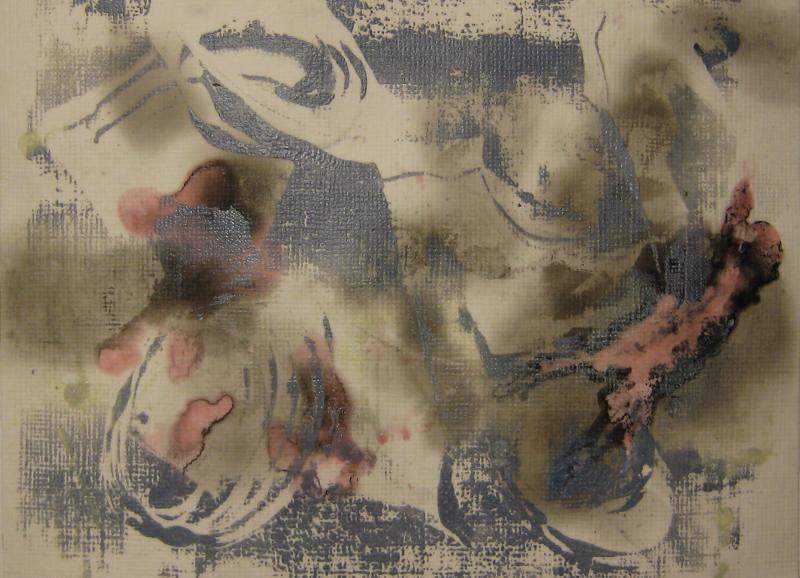
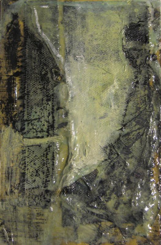
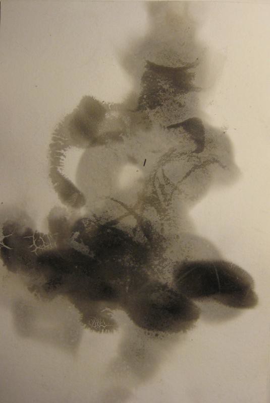
This looks a little dirty to me. I like the mysterious figurative suggestion but i think maybe it's the gold i don't like, it make the color pallet weaker than if it was just shades of gray.
needs more. There's no point. The eye goes to the black ink but it doesn't feel like that should be the most important part.
I like the shapes and layers but, meh...
i like the fact that the background lines define a figure without outlining it. But when i look at it, i'm not excited.
redo with hindsight knowledge
not horrible, but others from this batch just worked better and made me feel more excited.
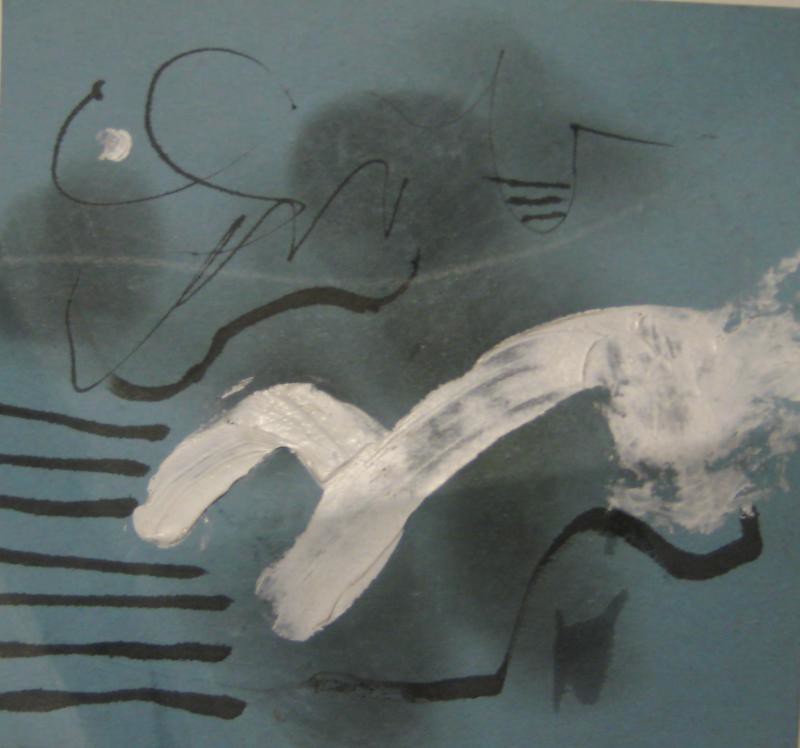
i think this needs a little more line, maybe in white.
who cares...?
I think this may be done, but I'm not sure yet, it may need a touch of white.
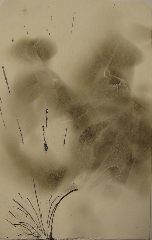
There are lots of interesting things going on but it gets a bit busy.
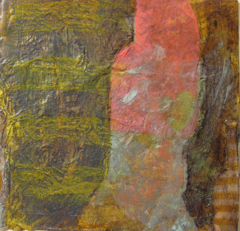
This could go somewhere but it's just kind of boring right now. I like the various yellows and texture.
I like the layering but I think it was better a few layers back... the composition is annoying me.
I think this is fun but I'm still working on playing with different media to further enhance it.
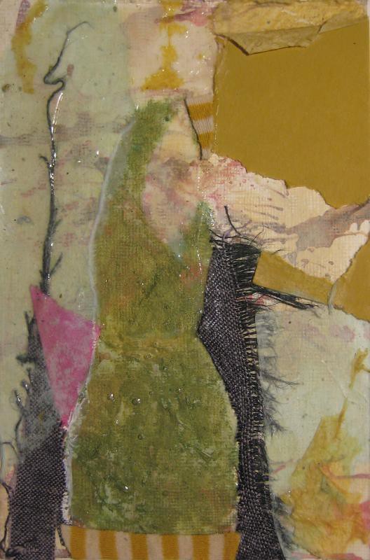
the face is weird on this, and I don't like the hair color with this pallet. I like the body. Maybe I'll crop off the head and make it more a square composition.
legs=bad. I was thinking of adding some more darkness down there, or turn it into a wiggly stripe rather than knobby knees.
I do kind of like this, but I just feel like it needs more something.
The black shape really annoys me, it's very unbalance but I do like the lines suggesting a garment but not completely drawing it.
Be brave and sploodge a load of stuff on that.
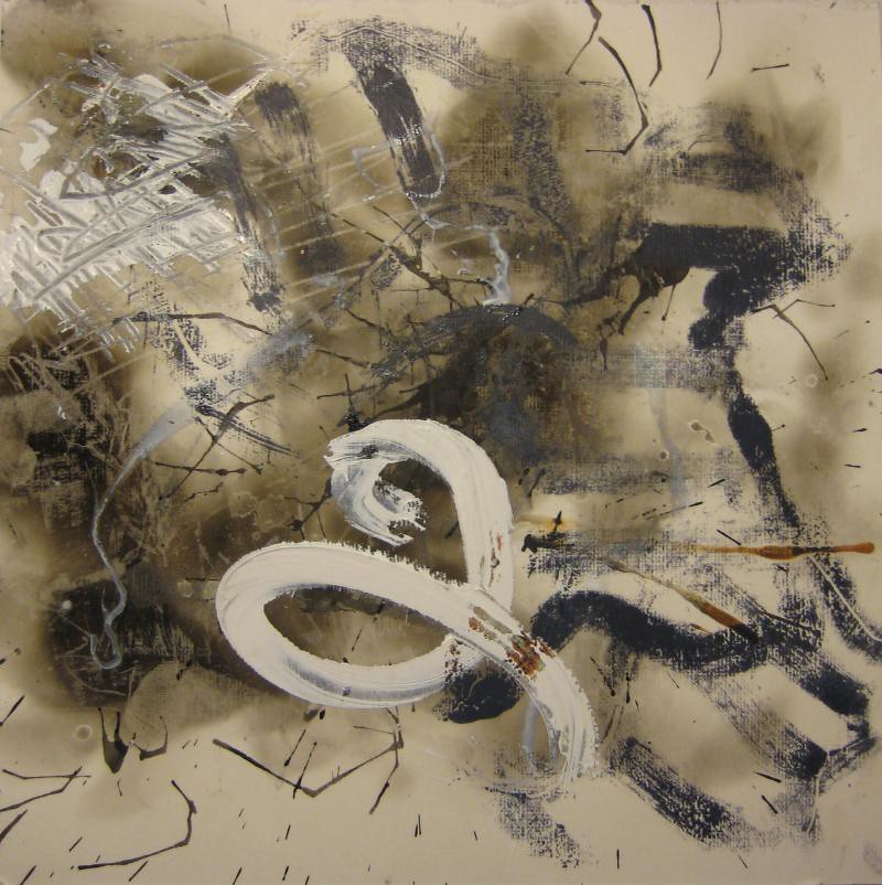
I like the white line and the texture but i still don't feel like it's finished. Needs more dark?
more stuff somehow. it's fresh
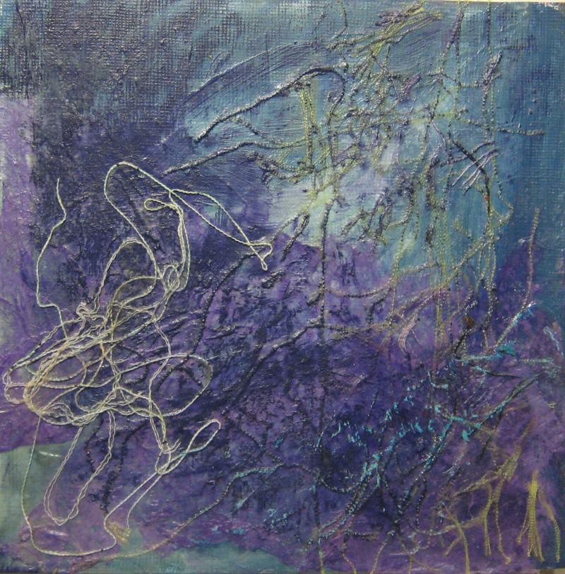
Interesting layering and texture but geometric art leaves a lot for me to desire!
This is growin' on me but it still needs more. I like the shape way more that before, and i like the textures on the inside and outside. I think we talked about letting he outside textures be more different on the 2 pieces. I want to do that and see what happens.
tone down the background.
These are the compositions that I downright do not like and why, at this point, I feel that way...
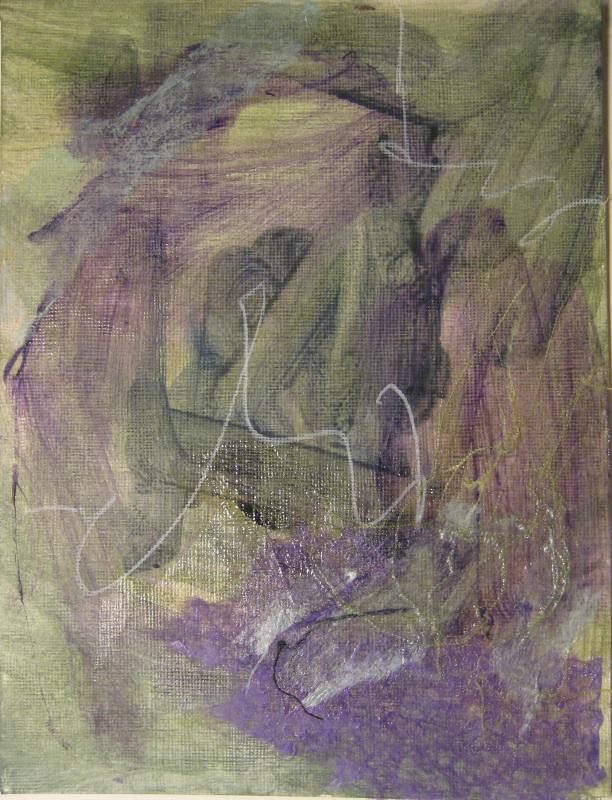
I have liked this varyingly as I've worked on it but now i think it lost some of what i liked and now feels pretty pointless. i don't like the texture of the tissue with purple paint on it. the other layers have an ethereal quality while that just looks like TP.
This is too chaotic and muddled. It has potential but it may just get worse.
big shape monoprint overtop
This thing definitely needs more layers. I'm retying cover up how i ruined it wit the figurative lines, i want the figure to be more subtle and integrated.
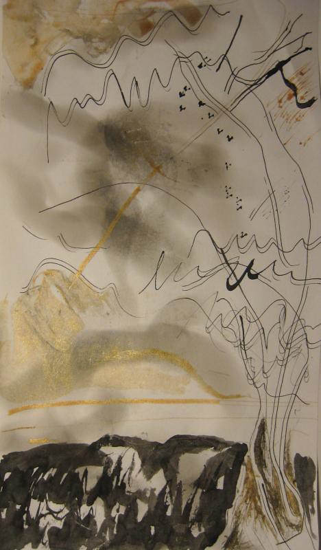
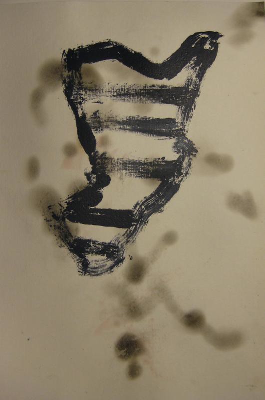
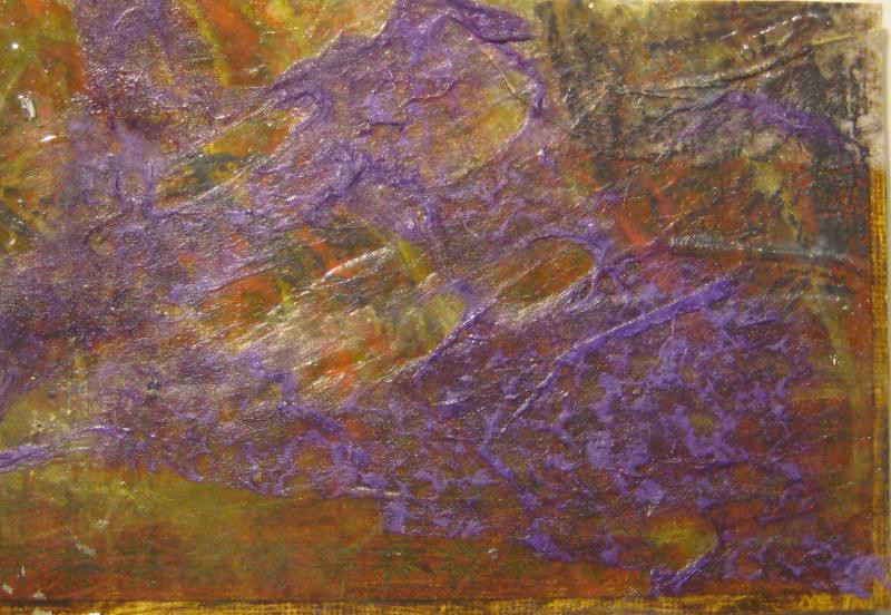
I hate every single thing about this, the composition, the colors, the fact it's a landscape with little flying v birds. The sections are too separate from each other. It's muddy and unfinished looking at the same time. I even dislike the paper it's done on. Barf!
try to repeat the tiny corner of goodness on a larger scale
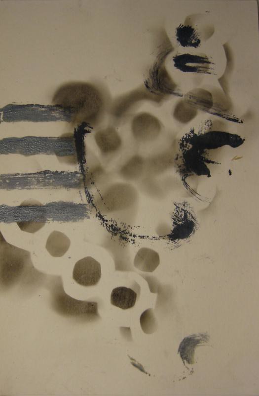
the upper right is such a nasty texture. There are tiny flecks of interest where the black and white interact.
more bad texture
Too much! Too busy! Too wild! I think even abstract expressionism should have some sort of method to the madness, a sort of beautiful chaos and this is just ugly.
i think this one needs a white layer next.
I like the shape and depth, needs white, pretty boring in general.
this is too busy, the relationship of the size of the shapes annoys me, it's either whispy or super heavy, no middle ground.
Get rid white spot on the top of chicken shit.
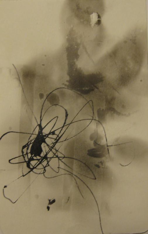
Boring, unbalanced, pointless
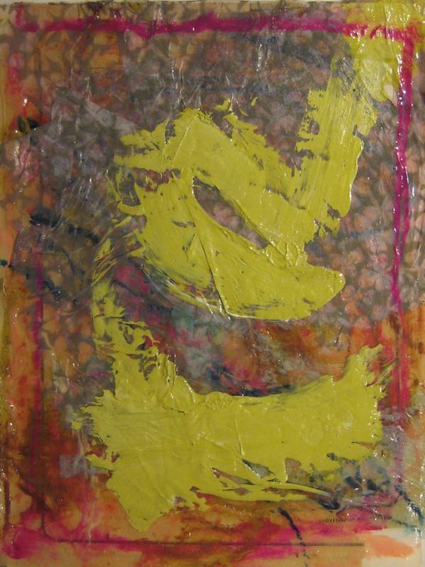
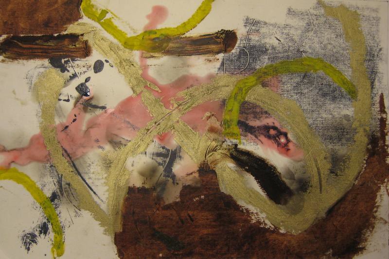
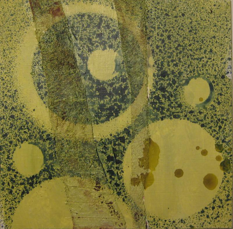
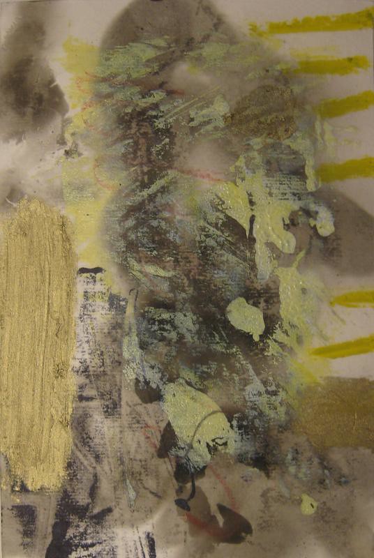
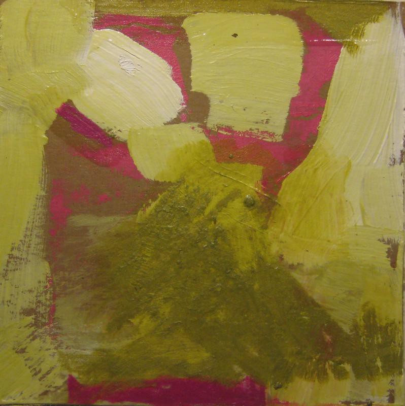
The yellow is merely slapped on top. It need work but I do think there are some interesting things going on in the periphery in all those layers.
make yellow more of a shape, more delibrate, i think more layers, so the yellow is inside instead of on top.
Over worked, hard! I think it was best before I put the figure in and then took it out (what am I doing the hokey pokey over here because this is NOT what it's all about!?!?!
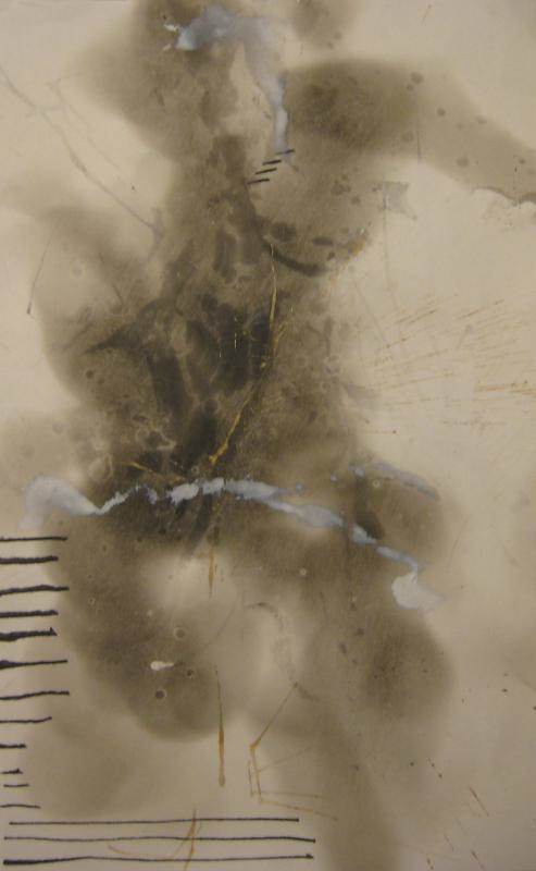
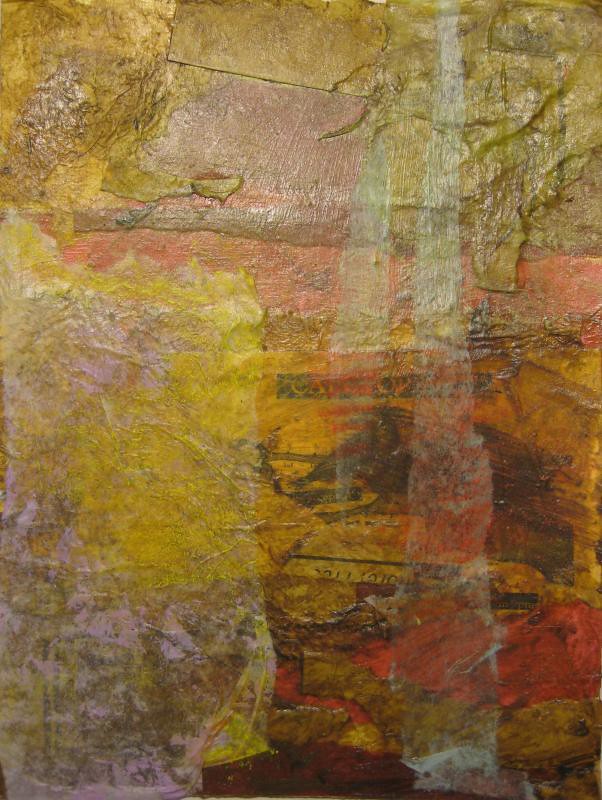
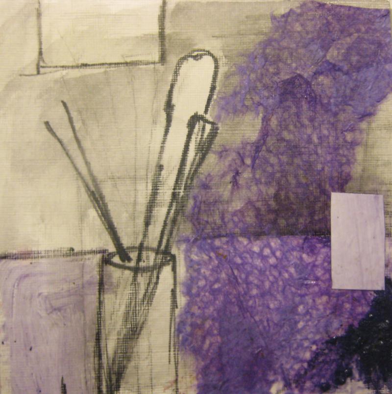
The raw cardboard is not helping, i like it value wise but it's rawness makes it look unfinished. It is unfinished, it's just 2 layers so far.
more of whatever it is i'm doing
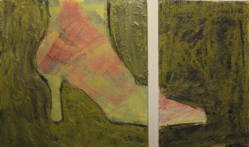
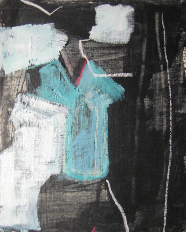
Ew!!!!!! The color of that skin is horrifying, it doesn't go with the palette, it's too separate and the shape too defined. I will definitely be dealing with that soon because i do like the color other than that and the composition is ok and the layering I find interesting.
get rid of skin, maybe connect hair and arm as one shape through face
this is just ugly, composition, texture, colors, the seperatness of each color, no color world.
i don't really know what happened with tha
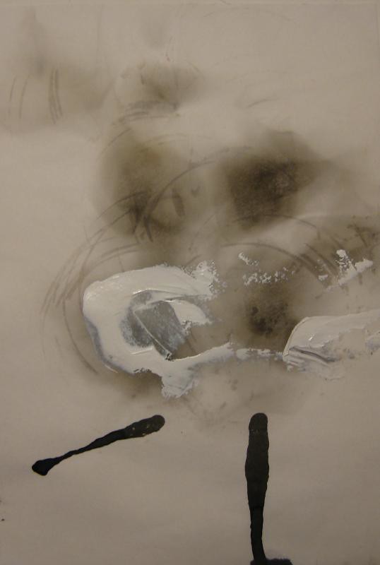
layer, salvageable as a background, but pointless as is.
need linear element
gross, i like nothing about this. It was a reject drawing first then i added all the purple and now it needs a lot more help or the trash pit as a new home!
treating it in a way that isn't tied to the realism. be irreverent.
Something still bothers me a lot about this. I think it's one for the scrap heap, I might cut out that hand though. It was an afterthought but it's the only good part.
This is another that went too far, or at least it was better before. I do think it would be easy to turn this into something better, yet pretty much unrelated.
bigger shapes?
This is honest, nothing contrived about it but i never figured out where to go next so i just think of it as a layer. I do see a bit of a figurative reference but i didn't know how to pull it out without being too obvious.
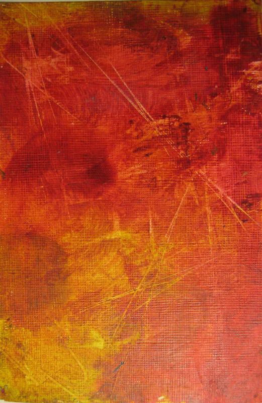
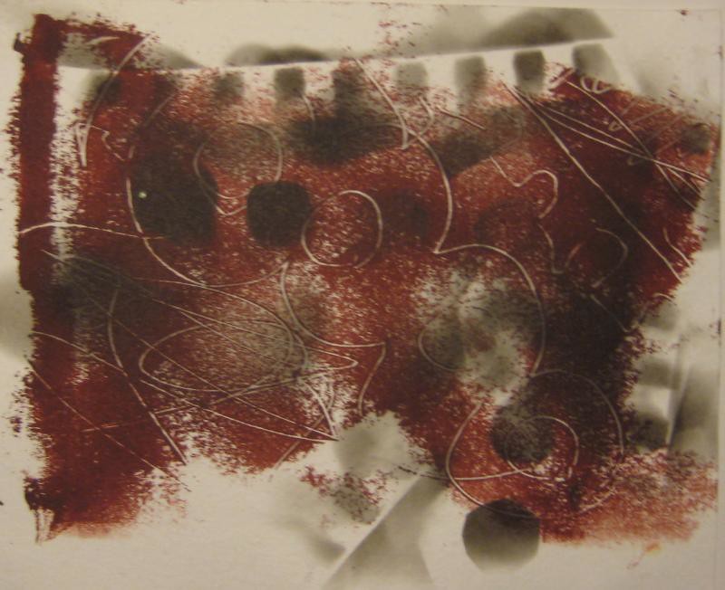
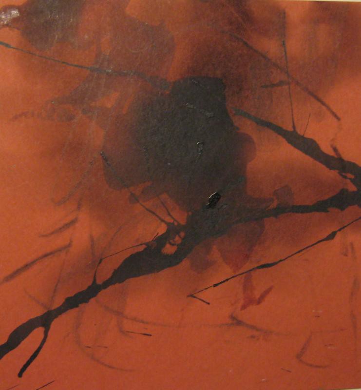
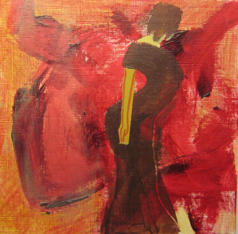
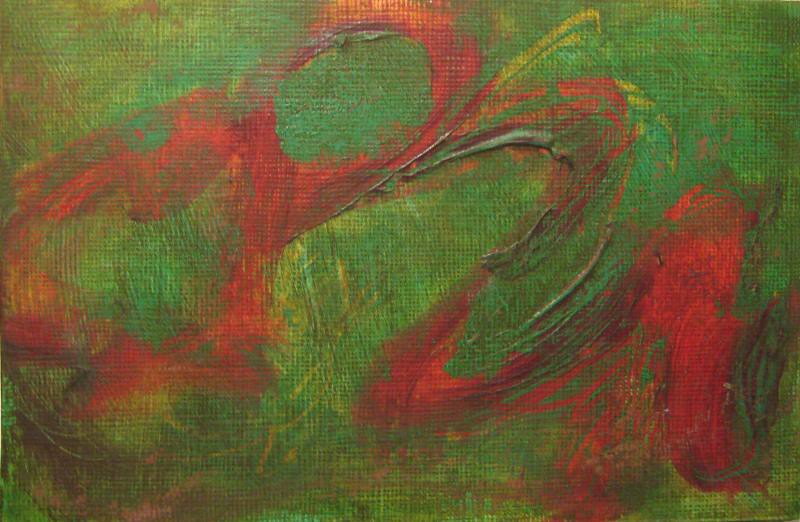
I did this the first week and I still do not like looking at it. I like the red, that's pretty much it.
No comments:
Post a Comment